Selected Work
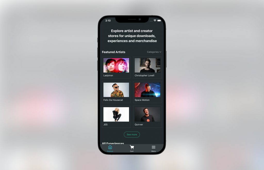
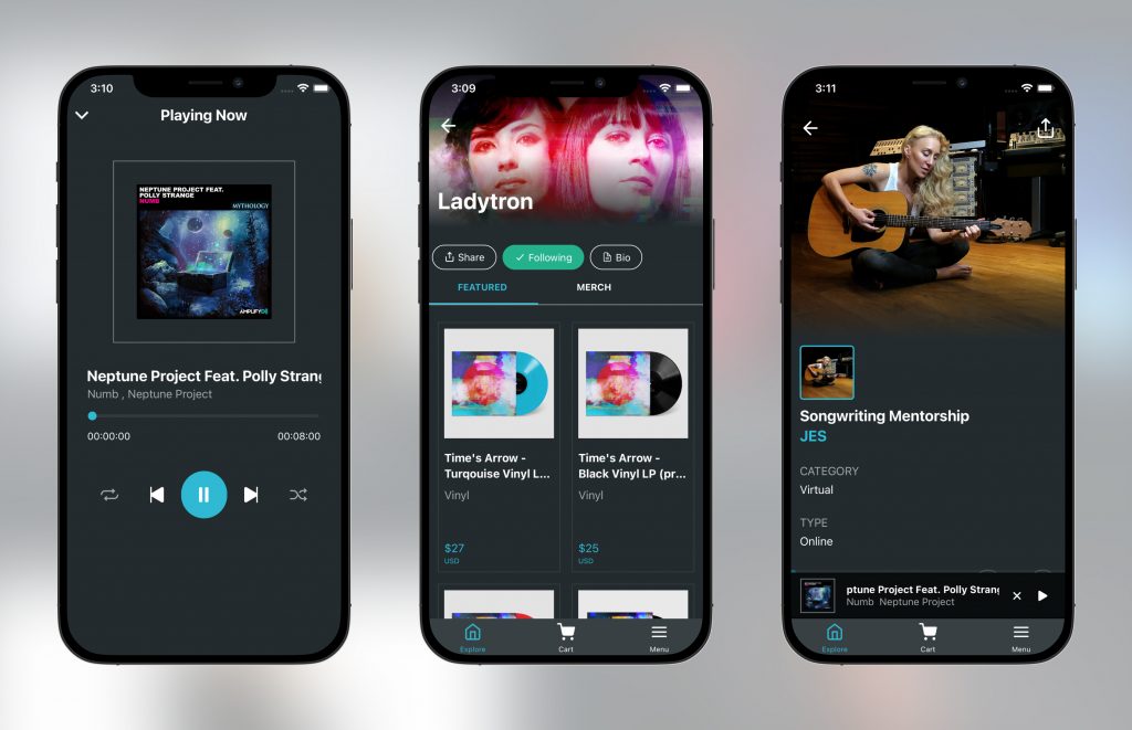
Amplifyd
A world where artists and communities flourish
Senior developer role handling every aspect of the mobile app delivery for iOS and Android for an e-commerce music platform.
Hands-on development approach, both building and overseeing a team for feature development in React-Native.
My Role
Head of Mobile Engineering
Hands-on React Native / Typescript
Includes: Music streaming, video messaging system, music downloads, purchase with Stripe / Apple Pay, push notifications and more
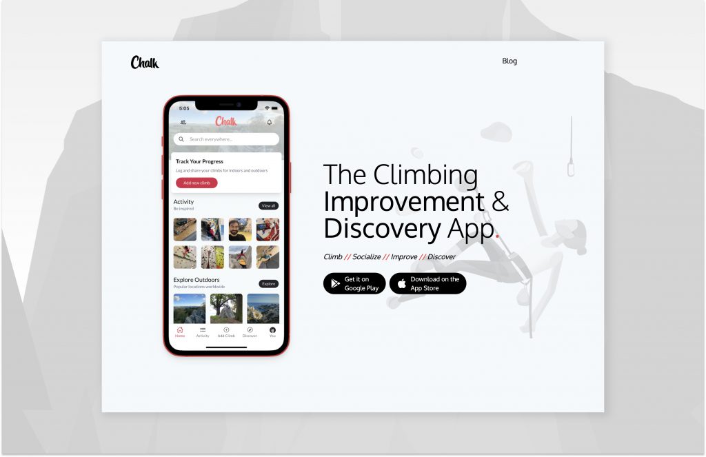
Chalk
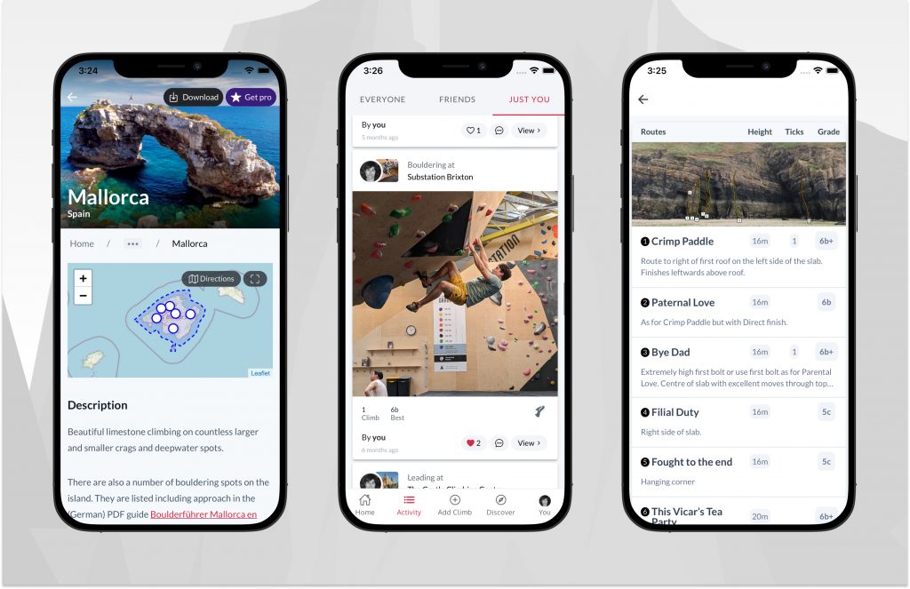
The Climbing Improvement & Discovery App
I am the founder of Chalk, the Climbing App discovery & Improvement. Chalk was “soft launched” August 2018 with a fully announced release planned for 15th November 2018. Chalk has 20,000 locations and over 100,000 routes, all indexed and searchable offline on Android and iOS. Chalk is built with Ionic 5 and Angular 8 with Firebase as the backend. I now have thousands of users. In 2022 Chalk partnered with the world’s largest climbing website. theCrag.com!
My Role
Product Design
Principal Developer
Founder
Time Out
Making Premium Profiles Possible
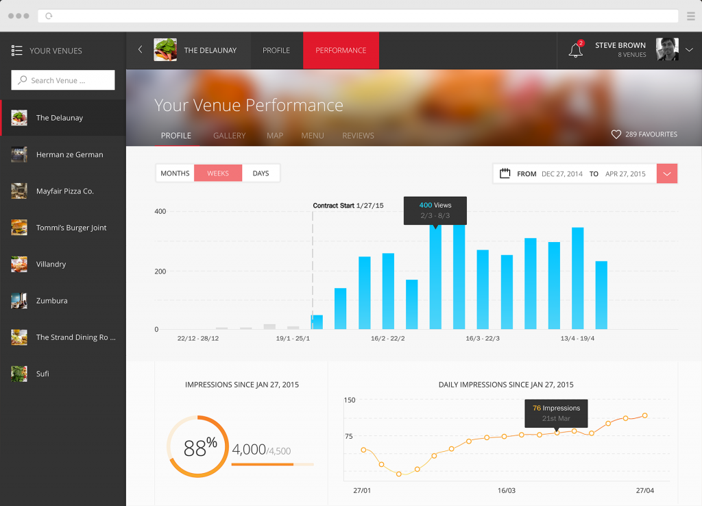
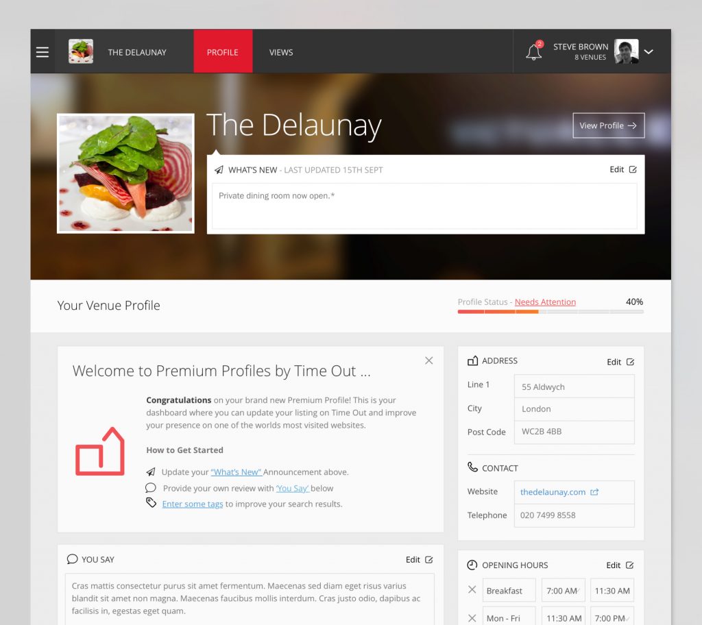
The Premium Profiles Dashboard for Time Out London, Paris & New York was a web application exclusively designed and front-end developed by myself for this cultural, well known magazine and website.
My role was to listen to the requirements of the product team, create a concept, design the user experience and UI, and development using the AngularJs framework, all based upon iterative feedback and agile processes.
Viewed as a primary business venture for the company, the result was a polished product with a full London and Paris launch within one year and New York soon to follow.
My Role
Product Design
Lead Front-end developer
Key Features of the dashboard
As a customer-friendly application, it’s users are Cafés, Restaurants, Pubs, and Bars across targeted cities such as London who have purchased a “Premium Profiles” product from Time Out giving them access to the following:
- Boosts their search ranking on the Time Out website via “sponsored listings” providing them with more page impressions
- Upgrades their profile on the Time Out websites to an “enhanced profile”
- Access to exclusive tools such as “Venue Says”, and a way to broadcast updates to create a more engaging public profile and search result
- Access to the dashboard (which I created) to manage the profile and view the performance for all of the above.
- Allows customers to edit their Venues profile on Timeout.com, such as broadcasting updates and “Venue Says”
- Allows viewing of analytical data for views and paid impressions.
- Launch was rolled out to London and Paris with New York to follow
- Allows multiple access to different venues from the same account, suitable for regional managers or owners who want to manage multiple venues in the same session.
- Pixel-fine design and animation, from analytics that animate-in to dynamic background blurs based on the venue’s imagery.
- Real time analytics fed asynchronously from an API
- Supports internationalisation (English and French)
- Single Sign on with a Time Out account
Signal by Plume
Resolve problems before customers know they exist
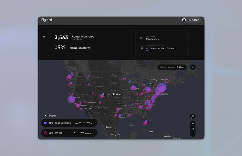
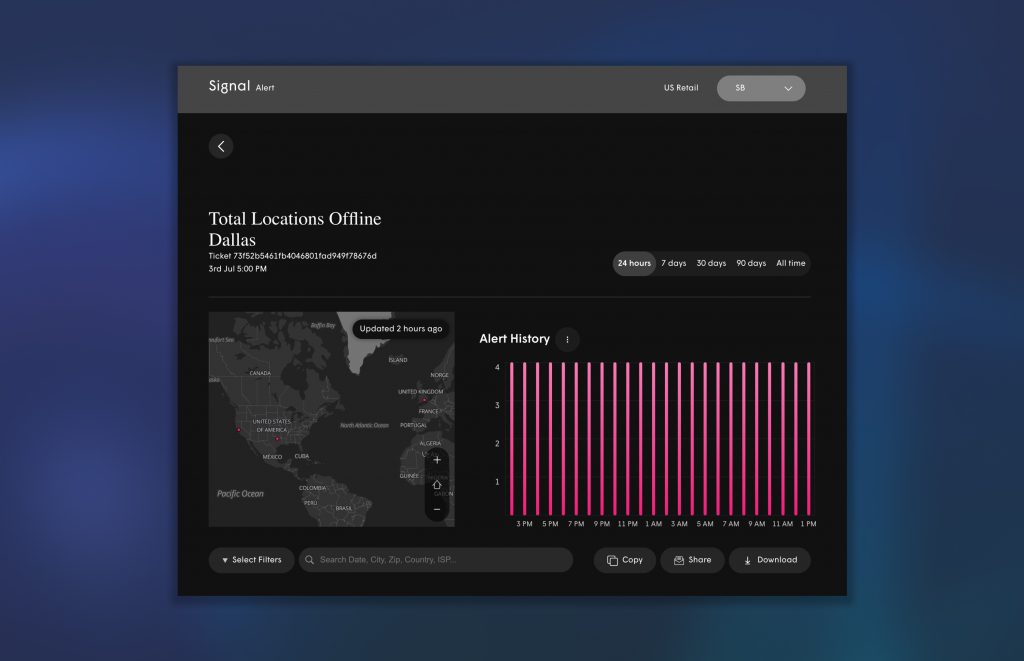
UI development for Signal by Plume, a next-generation experience that uses AI and machine learning to identify Wi-Fi performance issues, for example, outages and providing near real-time alerts based on data in the entire Plume network
By using AI to monitor WiFi performance, Signal proactively alerts support teams to issues before customer experience takes a hit.
LoveJunk
Rubbish Clearance
is Easy
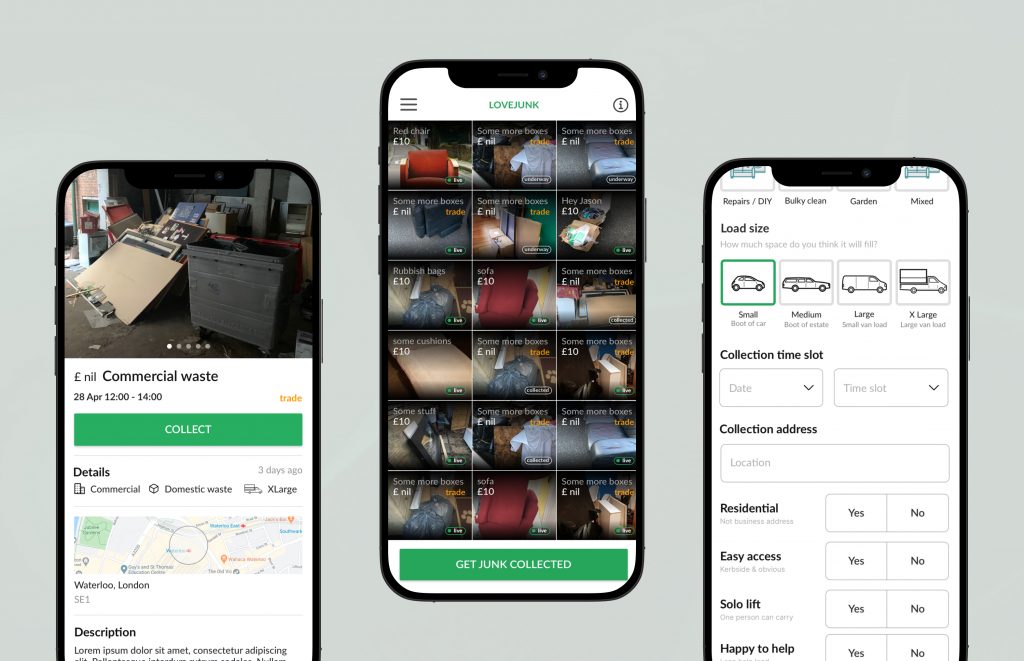
When rubbish collection company AnyJunk decided to expand its operations into the mobile app space, a new concept was born.
The idea was simple, people want to get rid of their junk quick and easily with minimum fuss, and collectors are eager to take it off their hands!
Introducing “LoveJunk“.
Operating like a “junk marketplace” of sorts, users can easily upload a picture of their unwanted items, and licensed collectors compete to collect the junk by offering competitive pricing. If the user is lucky, they will have competing quotes to choose from and get the best price for their collection.
Collaborating alongside Ryland Consulting who provided the UX journey, I designed the entire application. Built in React Native, I also created reusable components in Storybook to be used by the team where necessary.
In addition to the native application, I also designed and built the booking flow for the website.
LoveJunk saw a lot of success during the pandemic and still continues to grow today.
Red Bull – Off Premise Platform
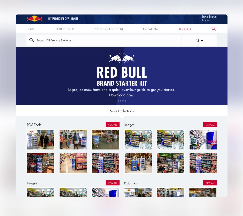
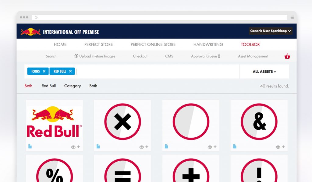
Create the Red Bull Perfect Store
An international app for the energy drinks brand that everyone knows about.. Red Bull! Designed to teach best practices in pursuit of the perfect store.
Features include, batch upload and downloading of images/preview, search, filtering, tag management, and a content management system. Plus oodles of interactive training tools. My involvement was lead front-end development and product design, turning the initial brief into reality.
Self Driving Campaigns
App development for Google Automating media plans and campaigns, keyword generation, forecast generation, and agency-client workflows.
Reusable, theme-able component Library built in Storybook
PingTune
The Music Messaging app for iOS and Android.
Search, share and chat about music. I provided front-end development.
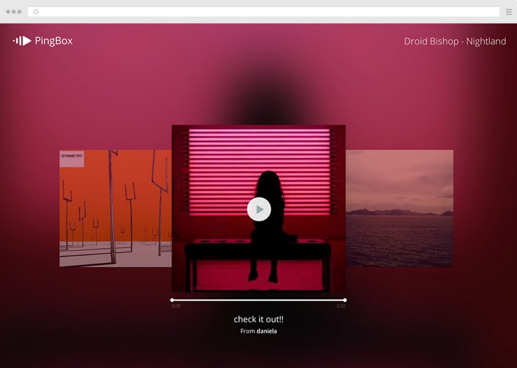
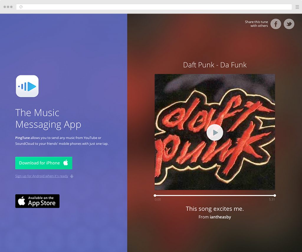
By setting a start and end point, you can send snippets of the song (or even the song in its entirety) via in-app chat, or share on social media via a “web player” to be viewed by a range of devices.
As I was involved in the web-orientated areas of the product, I designed and developed the shareable web player which has the benefit of promoting the app with full playback without necessitating the need to download.
I also provided web elements inside the native iOS and Androids providing core functionality to the playback of music.
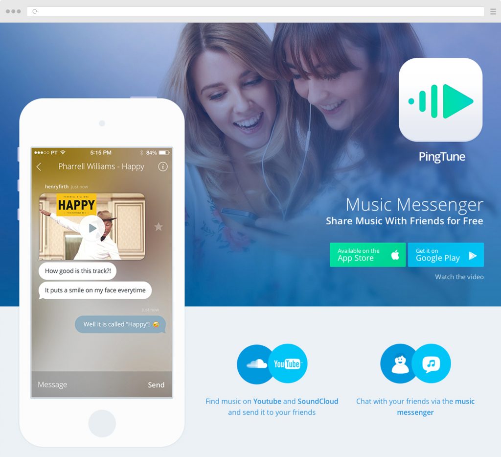
- Fully functional music playback in a shareable url based on unique urls generated from the app
- Mirrors key features of the native app, such as looped playback within selected markers (Only plays part of the song that the creator intended) and auto playback
- Plays content from Spotify and Soundcloud
- Displays the creaters comments
- Optimised for sharing on social media.
- Device detection for sending downloaders to either Google Play or App Store
Other credits: Daniela Alves – Design
Lost
New Music – No Barriers
LOST is a new app that enables fans to curate their music experiences together whether it’s from blogs, festivals, DJs or direct from the artist.
LOST approached me to promote their exciting new app by creating a version of their app exclusively for the browser, a progressive web app if you will. The result was a beautifully performing and fully functional music player that felt just like the native application!
- The general idea was that songs can be shared from people who do have the app installed, with their friends who do not have the app installed.
- The music player could play content directly from the LOST catalogue, or using YouTube, Spotify, and Apple Music.
The Science Gallery
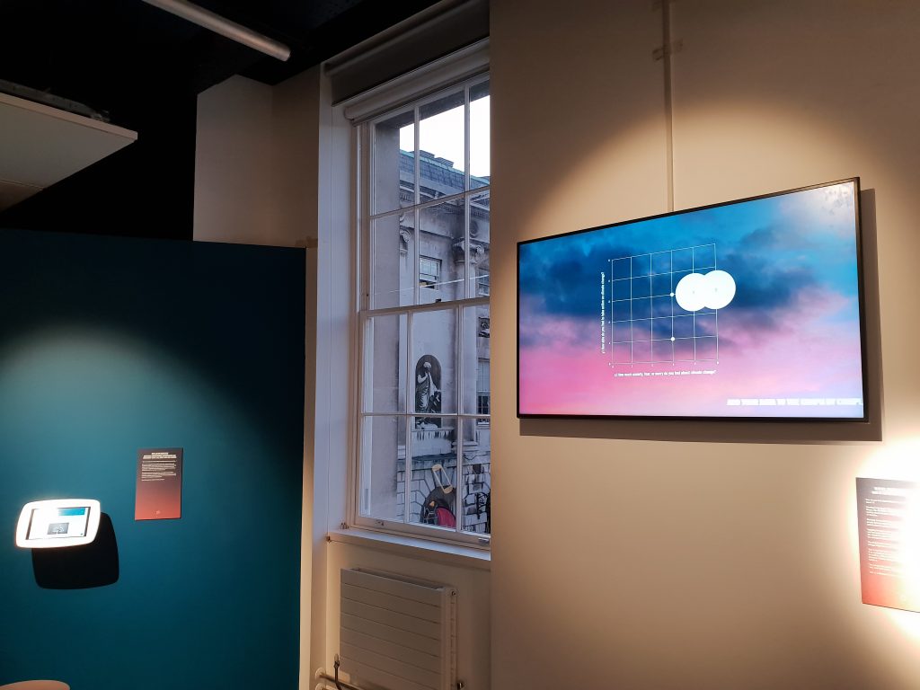
What are you doing about climate change?
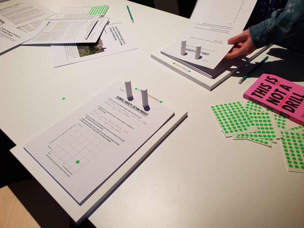
These important and poignant questions are part of their latest exhibition: ON EDGE | Living In An Age of Anxiety, which ran until the 19th January, 2020.
The questions are displayed prominently on a high resolution screen. Exhibition-goers are then invited to plot a sticker on a graph. The position of this sticker represents the visitor’s anxiety towards climate change and their perceived ability to do something about it.
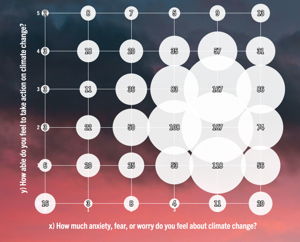
Read the blog post here
Hewlett Packard
Power. Performance. Precision.
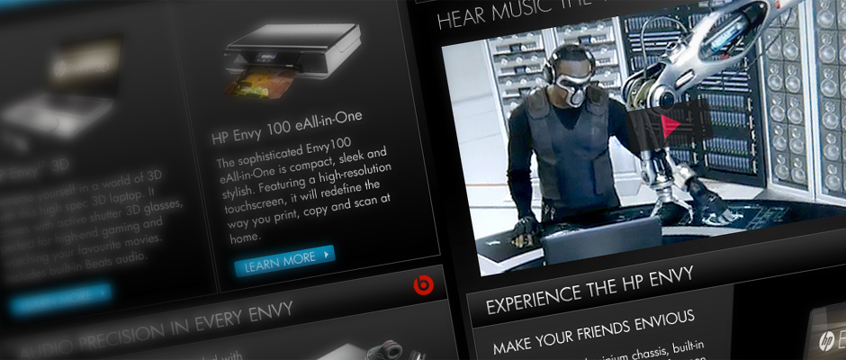
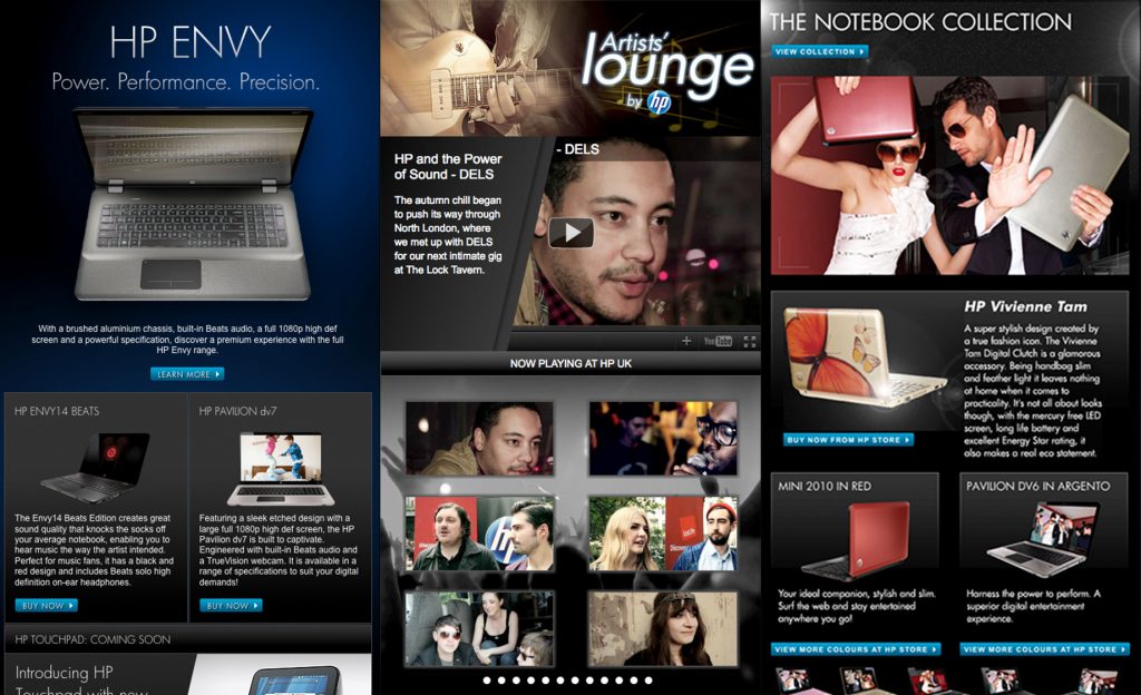
During my stint at Havas, I designed and built a range of applications for Hewlett Packard to promote their flagship devices such as the HP Touchpad (to rival the Apple iPad) the HP ENVY, and the NoteBook Collection.
One notable execution was the Official HPUK YouTube, a custom YouTube channel for HP. This was an application that mimicked the user interface of WebOs, and visitors could interact with Youtube videos in this way, directly on the channel! For example, a visitor could “swipe” videos left and right.
I also created the Artists’ Lounge which was a collaboration between HP and Music artists.
My Role
Creative direction
Design
Front-end development
Graze
It’s the healthy stuff
inside that counts
Today, Graze is a successful healthy food snacking service that delivers to your office or home. It promotes wellbeing and sustained energy throughout the day.
I joined Graze waaaay back in 2009 when they were a fledgling startup. The website allowed you to sign up as a new user, customise your box, and manage your subscription going forward.
I assisted with Front-end development to the Graze.com website, and I helped with design too.
I also helped create designs for print campaigns, such as this one for Connections mag.
My role
Web design
Front-end development
Design for print
theAudience
Design and UX for the company’s in-house apps Backstage and Stage which are a suite of analytics and social CMS tools.
Also provided Front-end develoment and created from scratch an agnostic ‘CSS Framework’ written in Less, similar to Twitter Bootstrap.
Eventually promoted to web development manager, using Agile/SCRUM methodologies, I managed a team of Javascript, LAMP, and UI developers to implement features for the companys in-house Social CMS and Analytics tools used by both the LA and London offices, plus liaised with a distributed analytics development team.
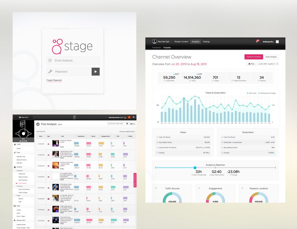
- Chiefly responsible for the user experience and visual design of the app, I ensured that what I designed was passed onto the team and built.
- Put procedures in place that covered the life cycle of a feature request, Research & Planning, Wireframing, Design, Sign-off, Development, User Acceptance Testing, QA
- Liaised with the product owner and stake holders to ensure that the team delivered tangible features that met business demands, but also managed flexibility for refactoring and technical debt.
- Received training and formal certification as a ScrumMaster
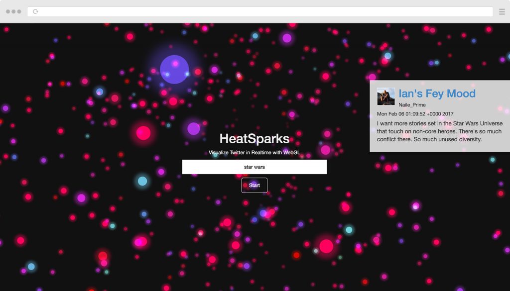
HeatSparks
Watch conversations in realtime
Heatsparks is a realtime visualisation of conversations on the web. Users can type in a keyword for any topic they are interested in and watch the conversation as they happen!
As soon as a conversation is picked up from Twitter, a spark will fly out from the centre of the screen and will revolve around a centre point in three dimensions.
The older the spark, the further away they are. Sparks as they happen will fly closer to the screen.
- The colour of the spark indicates how popular the content creator is. The more followers the “hotter” and more red they are. With less followers they are “colder” or more blue
- Potential applications could be used to show what kind of traction a particular topic is having, and if popular content creators are involved. Or it just looks cool on a big screen.
Peerdealer
Cut out the Middle Man
Product Design & Front-End Development for this social trading app that eliminates the middleman. You can buy and sell from markets that other users create.
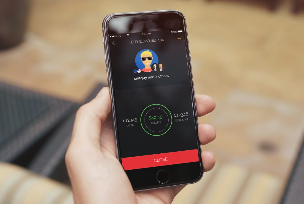
- Blazing fast allowing timely decision making
- One codebase for iOS, Android, and Windows phones.
- Real time trading
- Buy and sell direct from market makers
- Reactive infographic style layout for visualising positions.
